

Every designer has a white they reach for when a client says “just something white, nothing fussy.” For a large share of them, it is this one.
That popularity is also the problem. A colour recommended for everything gets recommended for rooms it does not suit, and the homeowner ends up with four gallons and a faint sense that something is off.
So here is the version that includes the failure cases.
The short answer
Benjamin Moore White Dove OC-17 is a soft warm white with a gentle grey-cream undertone, sitting in the brand’s Off-White Collection. Its published LRV is 85.38, though a widely circulated figure of 83.16 also appears across the industry.
White dove paint is not a true white. It reads clean against wood, brass and traditional trim, and it turns visibly creamy in strong southern light.
Before you buy: make sure you are buying the right colour
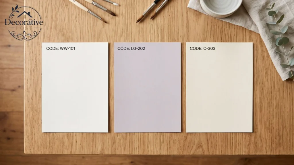
This matters more than it sounds. Three major manufacturers sell near-identically named whites, and they are not the same colour.
Benjamin Moore’s is White Dove (OC-17), a warm white. PPG sells Dove White, described by the manufacturer as a light, icy purple with a mulberry undertone. Valspar sells a Dove White of its own.
Walk into the wrong store, ask for “dove white,” and you may walk out with a lilac-leaning grey. The word order is the whole difference.
Always quote the code. OC-17 is unambiguous in a way that the name is not.
What colour it actually is
The colorant mix tells you more than the swatch does. White dove paint is built with a small amount of grey and oxide yellow, which is why it behaves the way it does.
That combination produces warmth without saturation. It reads soft rather than cream, and it avoids the buttery quality that pushes some warm whites into looking dated.
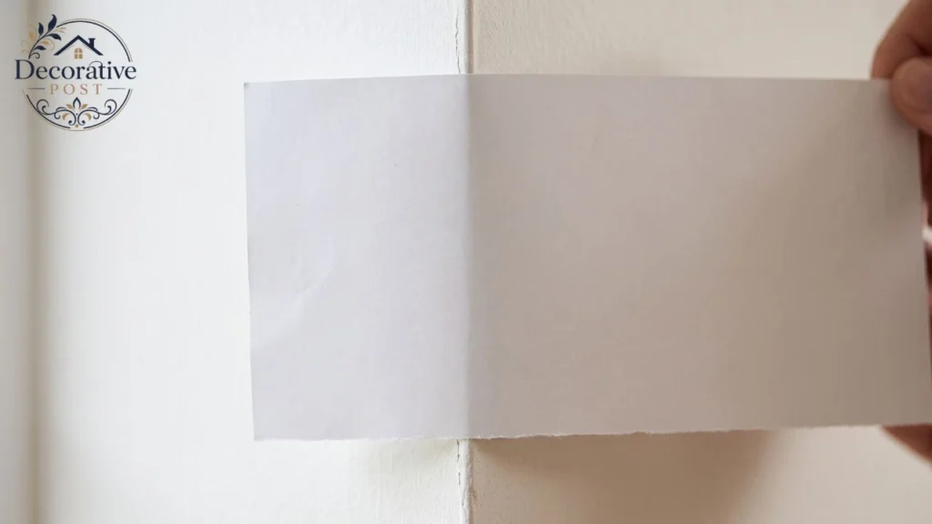
Put it beside a sheet of printer paper, and the warmth appears immediately. Put it on a wall with nothing white nearby, and most people read it as simply white.
This is the whole trick of the colour. It has enough undertone to feel comfortable and not enough to announce itself.
Compared to the seriously creamy whites, it is restrained. Compared to true whites, it is unmistakably soft. It lives in the middle, which is exactly why it gets specified so often.
The names behind the code
A small piece of trivia that turns out to be useful. White Dove also carries the legacy code PM-19, from the era when Benjamin Moore sold it as a pre-mixed colour rather than a tinted one.
You will still see PM-19 referenced on older specifications and in trade paperwork. It is the same colour.
It also sits inside the Off-White Collection, a curated group of roughly 150 whites and near-whites. That grouping matters more than it sounds, because the colours within it are designed to coordinate.
If you like White Dove but want something a half-step warmer or cooler, staying inside that collection is the efficient way to find it.
The practical takeaway is about ordering. Quote OC-17 to a decorator, a painter, or a trade counter, and there is no ambiguity. Quote the name alone, and you are relying on someone else’s assumption.
What it costs to get right
Paint lines change the outcome more than most people expect, and this colour is sensitive to it.
Benjamin Moore’s Aura line offers the strongest hide and colour depth, which matters on near-whites because thin coverage lets the substrate colour show through and shifts the undertone.
Regal Select is the more affordable route and performs well on walls. For trim and cabinets, the harder-wearing lines earn their premium because those surfaces get touched.
Coverage runs around 400 square feet per gallon as a planning figure. Divide your wall area by that number, then add a second coat on whites, two coats are not optional.
Primer matters here too. Going over a darker colour without a tinted primer will cost you a third coat, and near-whites are where poor priming shows most clearly.
Budget the sampling, not just the paint. Four peel-and-stick samples cost a fraction of one wasted gallon and considerably less than a weekend.
The LRV question, answered honestly
If you have been researching this colour, you have probably seen two different numbers, and nobody explains why.
Benjamin Moore publishes 85.38. A figure of 83.16 circulates widely across respected designer sites and paint retailers.
Both are real. LRV figures shift depending on the measurement method, the sheen of the sample measured, and whether the value comes from the manufacturer’s current data or from older published fan-deck records.
Practically, the gap is irrelevant. Anywhere between 83 and 85 puts White Dove firmly in soft-white territory, light enough to brighten a room, not bright enough to feel clinical.
What matters is the relationship to other colours, and that relationship holds regardless of which figure you use. Chantilly Lace at roughly 90 is meaningfully brighter. Swiss Coffee at roughly 82.5 is a fraction deeper.
Use LRV for comparison, never as an absolute prediction. The number tells you how much light a colour reflects. It tells you nothing about undertone, and undertone is what people actually notice.
How light changes it, room by room
The most useful thing anyone can tell you about white dove paint is that it is not one colour. It is four, depending on which way your windows face.
North-facing rooms receive cool, indirect light all day. White Dove’s warmth is an asset here it counteracts the grey cast that makes true whites look dingy in northern light. This is arguably its strongest application.
South-facing rooms get warm, abundant light for most of the day. White Dove leans noticeably creamier here. If you want it to stay crisp in a bright south room, a cooler white is the better call.
East-facing rooms are warm in the morning and cool by afternoon. White Dove handles the swing better than most whites because its undertone is muted rather than strongly yellow.
West-facing rooms flip that cool morning, golden late afternoon. Expect it to warm up considerably around five o’clock.
Reflected light matters as much as window direction. A green lawn outside, a red brick wall opposite, or warm oak flooring will all push the colour, and none of that shows up on a sample chip held in your hand.
How it compares to the other famous whites
This is the comparison most people actually came for.
| Colour | Brand | Approx. LRV | Versus White Dove |
|---|---|---|---|
| Chantilly Lace OC-65 | Benjamin Moore | 90.0 | Distinctly brighter and cleaner. The brand’s whitest white, near undertone-free |
| Simply White OC-117 | Benjamin Moore | 89.5 | Cleaner and brighter, but flashes more yellow in some light |
| Cloud White OC-130 | Benjamin Moore | 85 | Soft warm white with a slight yellow lean; very close relative |
| Swiss Coffee OC-45 | Benjamin Moore | 82.6 | A fraction deeper, with a green-yellow cream complexity White Dove lacks |
| Dove Wing OC-18 | Benjamin Moore | 83 | Slightly darker, closely related, easy to confuse |
| Alabaster SW 7008 | Sherwin-Williams | 82 | The closest cross-brand equivalent. Slightly less muted, so it reads creamier |
| Pure White SW 7005 | Sherwin-Williams | 84 | Cooler and crisper. Better in bright south rooms, can feel stark in north light |
| Greek Villa SW 7551 | Sherwin-Williams | 84 | Comparable warm white, but with more obvious yellow-beige |
Three practical conclusions come out of that table.
If you want brighter, go Chantilly Lace. If you want warmer and creamier, go Swiss Coffee or Greek Villa. If you are switching brands, Alabaster is the nearest honest equivalent.
And if you are choosing between White Dove and a true white like High Reflective White, you are not really comparing two options. They do completely different jobs.
What not to pair it with
This is where most White Dove schemes go wrong, and it is almost always the trim.
This is the same undertone logic that governs any muted neutral our guide to gray green paint colours walks through how bias behaves when two close colours meet.
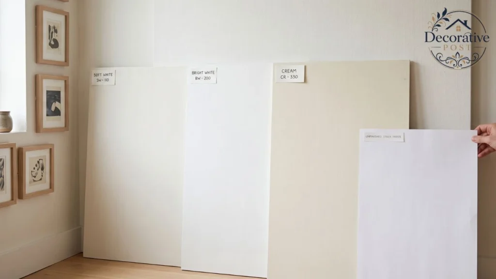
Blue-based whites fight it. Decorator’s White, White Diamond, and SW Extra White all read cool, and beside White Dove’s grey-cream warmth, the result looks discordant rather than layered.
Whites darker than White Dove fail in the other direction. Swiss coffee used as trim against White Dove walls tends to read dingy because the trim is doing the opposite of what trim should do.
The safe combinations are narrow and reliable. Chantilly Lace on trim gives the cleanest definition. Simply White gives a slightly warmer version of the same effect. Oxford White works when you want more contrast.
White Dove on both walls and trim is the fourth option and increasingly the most popular. Tonal, enveloping, and impossible to get wrong because there is no relationship to manage.
There is one context worth flagging. If your room contains Carrara marble or another cool stone, White Dove on an adjacent surface can look muddy against it. Keep some distance between the two, or choose a cooler white.
Where it works best
Cabinets are where White Dove Paint has built its reputation. It softens a kitchen without going cream, and it sits comfortably with both warm wood and painted islands in deeper colours.
It suits the flat and shaker fronts common in modern kitchen cabinets, and it is a mainstay of the softer coastal kitchen palettes where a true white would feel too hard.
Trim is the other classic use, and it is the application many decorators have specified for decades. It gives you crisp edges without the hard glare of a true white. It is also the default choice for painted joinery, which is why it appears so often on DIY built-ins and in grandmillennial schemes where traditional moldings carry the room.
It also gives you a forgiving backdrop for art and gallery walls, which matters if you are still working out how to decorate your walls.
Whole-house schemes suit it well because of that lighting stability. A color that behaves predictably from the north-facing study to the south-facing kitchen is rare, and it is the main reason this one gets specified across entire projects.
Ceilings work beautifully, particularly matched to the trim. The effect is quieter and more expensive-looking than the default flat builder white. If you are undecided there, our guide to what colour to paint a ceiling covers when to match and when to contrast.
Where it struggles: very bright south-facing rooms where you want crispness, high-contrast modern schemes with black window frames, and anywhere sitting directly against cool stone.
Sheen, by surface
Sheen changes how a colour reads as much as light does. Higher sheen reflects more, which makes the same paint look slightly lighter and the undertone slightly more visible.
| Surface | Recommended sheen | Why |
|---|---|---|
| Ceilings | Flat | Hides drywall imperfection; no glare |
| Living and bedroom walls | Matte or eggshell | Soft finish, keeps the colour calm |
| Kitchen and bathroom walls | Eggshell | Washable without shine |
| Trim and doors | Satin or semi-gloss | Durability and a subtle step in sheen read as considered. |
| Cabinets | Satin | Cleanable, less clinical than semi-gloss |
| Exterior siding | Low luster | Reduces glare on large surfaces |
If you are repainting existing cabinetry rather than ordering new, our guide to painting furniture without sanding covers the prep that decides whether satin holds up.
Matching trim and wall colour but stepping the sheen is a technique worth knowing. Same color, different finish, and the architecture still reads.
The colour-matching trap
A specific warning about white dove paint, because it catches people out regularly.
You can have almost any paint colour matched at almost any store. White Dove is the exception that proves the rule badly.
Colour matches of White Dove made at other brands have a documented tendency to come out slightly green. The original is mixed with Benjamin Moore’s proprietary colorant system, and the matching process approximates it with a different chemistry.
On a dark saturated colour, a small approximation error is invisible. On a near-white, the same error is the entire undertone.
If you want White Dove, buy Benjamin Moore. If budget rules that out, choose a colour that is native to your preferred brand Alabaster from Sherwin-Williams, for example rather than a match.
On exteriors
White dove paint works well on siding, and the reasoning is different from interiors.
Exterior light is brutal and unfiltered. True whites on a large sunlit elevation produce genuine glare, and the softness here takes the edge off without reading as cream from the street.
It is a safe choice for front porch and entry schemes too, where the colour meets both painted trim and natural materials at close range.
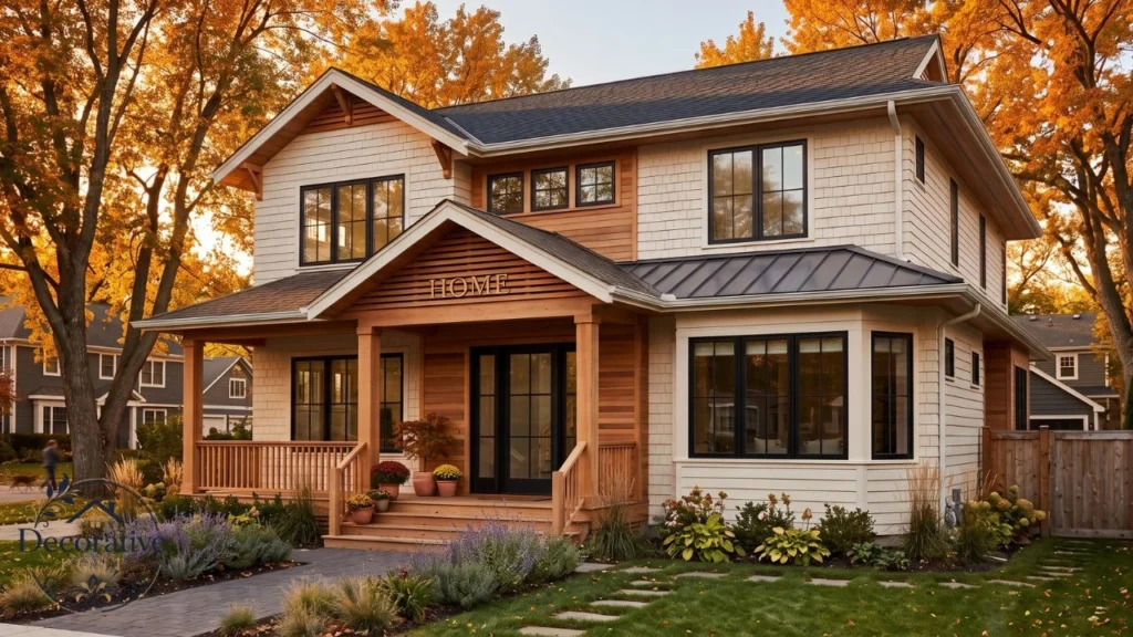
It pairs particularly well with black or bronze windows, natural stone, and cedar. The grey in the undertone is what lets it sit against cool materials outside in a way it sometimes cannot indoors.
Test exterior samples on more than one elevation. A north wall and a south wall on the same house can look like two different colours, and the difference is far larger outdoors than indoors.
How to sample it properly
Sampling badly is worse than not sampling, because it gives you false confidence.
Do not judge from a chip. A two-inch swatch surrounded by white card is being influenced by the card.
Paint a large sample. Two feet square, minimum, two coats, on white poster board rather than directly on the wall. The board is movable, and your existing wall colour will otherwise contaminate the reading.
Move it around. Look at it on every wall in the room, at three times of day morning, mid-afternoon, and under artificial light at night.
Hold it against your fixed elements. Countertop, flooring, cabinetry, tile. Warm metals matter here as well if you are working with aged or antique brass, the grey in this colour is what keeps the pairing from tipping gold. The colour has to work with the things you are not changing, and those are what should decide it.
Check it under your actual bulbs. A 2700K warm bulb and a 4000K cool bulb will show you two noticeably different whites.
Peel-and-stick samples make all of this considerably less painful, and they eliminate the sample-pot-on-the-wall problem entirely.
Living with it after the paint dries
Reviews stop at the moment of choosing. The colour keeps going for years after that, and a few things are worth knowing.
It touches up well, which is not true of every white. Because the undertone is muted rather than strongly pigmented, a small repair blends more forgivingly than a creamier white would.
Keep a labelled jar from the original batch rather than buying a fresh quart later. Batch-to-batch variation is tiny, but on a near-white, tiny is visible under raking light.
It also ages gracefully. Warm whites can yellow over time with sunlight and heat, particularly in oil-based finishes. Modern waterborne formulations have largely solved this, but a south-facing trim run will still shift slightly over a decade.
Cleaning matters more than the colour does. Most whites that look tired are not discoloured, they are dirty a wipe with a damp cloth restores more than people expect, which is the argument for eggshell over matte in a busy hallway.
One last observation from real rooms. Almost nobody notices this colour, and that is the compliment. It disappears behind furniture, art, and light, which is exactly what a background colour is supposed to do.
Five mistakes worth avoiding
Choosing it from a screen. Every monitor renders it differently, and this article’s images are no exception.
Pairing it with a blue-white trim. The most common failure, and it looks like a mistake rather than a choice.
Using it in a bright south room and expecting crisp. It will go creamy. That is not a defect; it is the colour doing what it does.
Colour-matching it elsewhere. Green undertone, reliably.
Skipping the fixed-elements check. The countertop you are keeping should have more say in this than the Pinterest board.
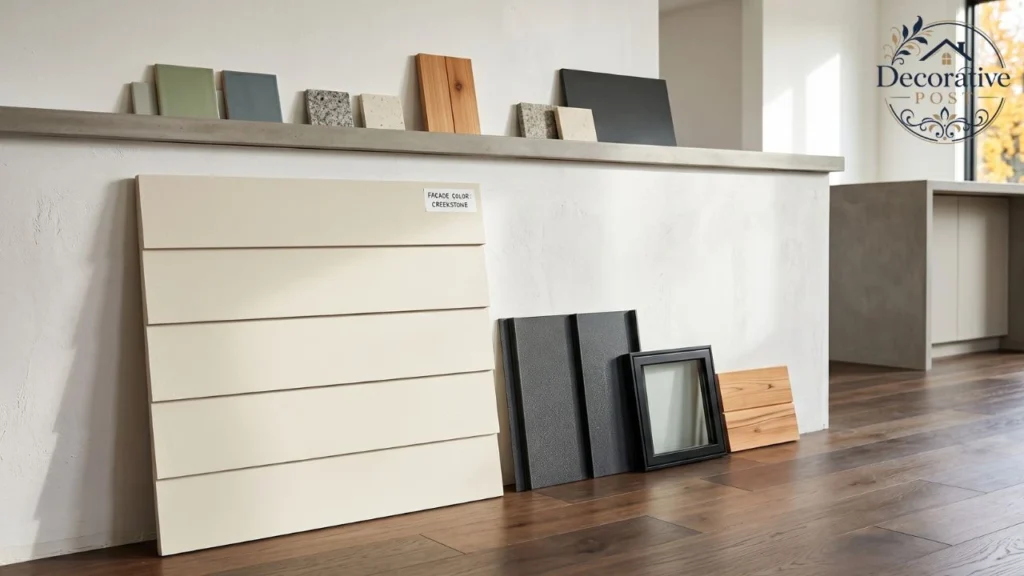
So is it right for your room?
Three questions settle it.
What direction does the room face? North or east, and White Dove is close to the ideal soft white. Strong south, and you should look at something cooler unless you want warmth.
What are your fixed elements? Warm woods, brass, travertine, and beige stone excellent fit. Cool grey quartz, Carrara, chrome, black-and-white contrast schemes consider Chantilly Lace instead.
What do you want the room to feel like? Calm and enveloping, or bright and crisp. If the answer is the former, it belongs in the same conversation as everything else that makes a cozy living room work. White dove paint does the first exceptionally well and the second not at all.
That last question is the one most people skip, and it is the one that actually predicts whether they will be happy in six months. A colour that does its job well is not the same as a colour that does your job well and after thirty years on fan decks, White Dove’s job has always been quiet, not bright.
FAQs for White dove paint
Is Benjamin Moore White Dove warm or cool?
Warm. It carries a soft grey-cream undertone from a mix of grey and oxide yellow colorants, which makes it read as a warm white without looking yellow.
What is the LRV of White Dove?
Is Benjamin Moore White Dove warm or cool?
Warm. It carries a soft grey-cream undertone from a mix of grey and oxide yellow colorants, which makes it read as a warm white without looking yellow.
Does White Dove look yellow?
Not usually. The undertone only becomes obvious beside a true white or a sheet of printer paper. In strong south-facing light it will read creamier, but it rarely flashes yellow the way some warm whites do.
What is the Sherwin-Williams equivalent of White Dove?
Alabaster SW 7008 is the closest. Both have grey-yellow undertones, though Alabaster is slightly less muted and reads a little creamier.
What trim colour goes with White Dove walls?
Chantilly Lace OC-65 for the cleanest definition, Simply White OC-117 for a warmer version, or Oxford White CC-30 for more contrast. White Dove on trim as well is also a popular tonal approach. Avoid blue-based whites.
Is White Dove good for kitchen cabinets?
Yes, it is one of its most common uses. Satin sheen is the usual specification, and it pairs well with both warm wood and deeper island colours.
Can I get White Dove colour-matched at another brand?
You can, but matches tend to come out slightly green because the original uses Benjamin Moore’s proprietary colorant system. Choose a colour native to your preferred brand instead.
Is White Dove the same as PPG Dove White?
No. They are entirely different colours from different manufacturers. Always specify the code OC-17.